One of the most beautiful albums ever recorded - can be played back-to-back without fatigue.
Excellent. Timeless
From the era when records belonged to artists and not crap marketing departments. A genius album with a title that would be marketing dept rejected and a cover that has to be one of the best to ever keep the dust of a record.
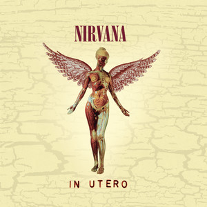
A fabulous concept albume further enhanced by the astounding artwork by Barry Godber. The artwork was universally adopted and must have sold many copies of the album by those mesmerised by its power.
I didn’t buy it when it was released as I didn’t like it. I now played it 10 times back to back as it’s highly regarded just in case I was wrong. But I wasn’t. It’s rubbish. I like the sleeve though. Ron Coro – art direction
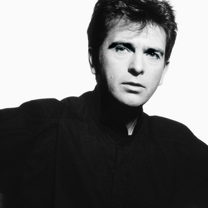
Johnny Lee – design. Elliot Gilbert – photography
This is awful. I would have to be off my face to enjoy this
For posh people who don’t like music but think they do
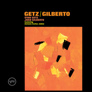
Music is ok in a 1950's vibe. The sleeve is not so nice featuring Primitive Masks from Carlebach Galleries NewYork photographed by Lester Kraus and an average type layout. Standard b/w reverse layout by a printer. Roulette 1958 pressing has good, graphic, generic labels.
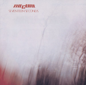
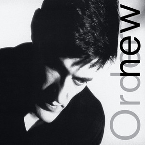
Great music wrapped in an excellent cover designed by Peter Saville and Martyn Atkins. Front layout is well considered with a fine border and some delicate type. The reverse and inner bag have been laid out with care. Factory records allowed the band's name to appear on the reverse and just the album title on the front. Very intelligent and mature attitude towards design from the record company, whilst not towing the major record company folklore about a record not selling unless the band's name was big and at the top of the sleeve. The photograph of the Appiani family tomb in Genoa's Monumental Cemetery of Staglieno was taken by Bernard Pierre Wolff in 1978. The tomb is a large work created & sculpted by Demetrio Paernio in 1910. Various versions printed on different card grades could have been on purpose, but more likely the printer's lack of consistency. Still, the overall package is lovely and enjoying the sleeve is part of enjoying the music.
Hmmm - the cover, a painting by Wayne White, is the only thing of value here; the comparisons to Ed Ruscha, just because they both use type, are lazy. Worth looking at Wayne White's other paintings too; even though they are numerous versions of the same idea, they are well executed. Much more interesting than the music.
Music is tragic and the sleeve a horror, designed by the much-respected Paula Scher and illustrated by Roger Huyssen for Epic Records,
Scher, who once designed covers and worked as an art director for major artists such as The Rolling Stones, admits she's “mystified” by the continued interest in this album package. “The Boston cover was designed in 1976 and is now 39 years old,” she says. “It was, and still is, in my opinion, a mediocre piece of work.”
The Atlantic 2015 (edited)
A space-shaped guitar destroying Earth - what were they thinking?
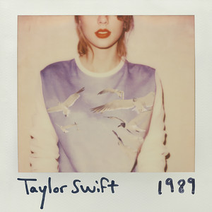
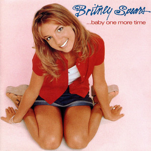
So a record executive has a great idea - use an unremarkable press shot for the sleeve - genius - retouch her teeth and bleach the whites of her eyes and slap some type on the top and another iconic sleeve is born. Larry Busacca, who took the photo, is often not credited.
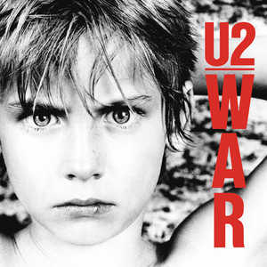
I'm not sure if this is a good thing or not. He's a bit cheesed.
https://www.instagram.com/p/Bsn8bBLlAE8/
Not much worth listening to on this album unless you like paper-thin lyrics and dull tunes. 'The beat goes on' is a nice song, but this is not a good cover.
Excellent artwork utilising the image created by fashion photographer Vic Singh. It is reported that he was sent an advance copy of the music and after listening to it, wanted to do something in keeping with the bands alien sound so asked the band to bring bright clothes then shot on his Hassleblad using a prism lens that George Harrison had given him. All this in 1967 before the emerhence of computers or heinous Ai. Somewhere theres a piece of film with this shot on and polaroids, capturing the moment in analogue perfection.
Music is great too.
Wow- a proper sleeve - well worth a google to learn more about the dedication of designer Peter Corriston to create not just the cover image, using a raft of talent, but also the complexity of the whole package. this is how record should be, not lazy slapped on type on a press shot. Slevees have much more value than just keeping the dust off Robbo. The story on 'behind the covers' is a good read.
Music is beyond.
A perfect package
Derek Riggs creates the horror cartoons and Steve Harris claims to have created the logo however there are conflicting opinions to that. The best I have discovered so far is that it was an uncredited font by Alphabet Photosetting called Busk(source.fonts in use). Dennis Wiilcok, then a studio manager at Crowes Studio in 1977, ordered the bands name as PMTs (pre computer typesetting was photographic-type physical prints) Allegedly his young designer Ray Hollingsworth adapted it to the Maiden logo. (source dafont.com)There is chatter that Vic Fair designed the bespoke font but most likely is that he was an early user and just ordered the font from the type house. You can get your own version as it was redrawn in 1996 and renamed 'Metal Lord' Usually those with the loudest voice who say it the most often get to claim the credit. Not a great sleeve but good branding . Music is horrible
The album cover for Madman Across the Water was embroidered over two weeks by Janis Larkham, wife of the album art director David Larkham. She used the back of an old Levi's jacket, and the original was gifted to Elton. There was no initial run of expensive album covers with similar embroidery, nor embossed versions; it was flat-printed - ie studio photographed - scanning was in its infancy, so everything was analogue, though it did include a lavish booklet.
Janis chose to credit herself as "Yanis" for this artwork.
(source-https://rachelandersontextiles.com/blogs/posts/seamstress-for-the-band)
Normal whiny Elton John record inside some thoughtful packaging
Bob cato took the album pic. Taking photos was obviously not his bag, but apparently art direction was. For two cover designs Cato was awarded Grammys by the National Academy of Recording Arts and Sciences. They were for Barbra Streisand’s “People” (1964) and for Bob Dylan’s “Greatest Hits” (1967). Allegedly ground breaking at the time. Later, in 1997, the Recording Academy would award Cato its President’s Merit Award. (source Rochester Institute of Technology) - got to say as he seemed to get a lot of credits - must have worked really hard at making sure his name was on it as 'Vice President for Art and Design'.
Music on this record is great.
There is some uncertainty regarding the cover photo with both Joseph Cultice amd Randy G credited in different versions of the release. Who could blame them for not claiming this shocker? Jennifer Barbato was the art director, she has produced some nice work elsewhere.
Music is a horrific as the sleeve.
Why is this crap in this list?
Ed Fotheringham's illustration is the cover art here and supposedly his crazy chaotic style suits the music. Cover is ok but the music is better and darker than the cover. I didn't know this band so thanks 1001.
Theres a YouTube video by Hugh Syme about how he came up with this sleeve, photographed by Deborah Samual, a friend, who also appeared in one of the framed images as Joan of Arc, allegedly the photo session was a druken fun affair. Hugh also won the Juno award for best Album. WTF terrible album wrapped is a silly cover.
Art Direction & Design: Jeri Heiden and Glen Nakasako aka SMOG Design. Photography: Miranda Penn Turin. This was a pretty succesful repositioning exercise for Christina, moving her from bobblegum to Xtina, a more uninhibited, sexually liberated personality. While not ground breaking the sleeve is good, solid and well crafted, shame the music is crap.
Album art direction by Randall Martin, still working, and photography by Jeffrey Henson Scales, who is a legend. Got to say I really liked it when it came out as it was very distinct with lots of personality, just like the music. Hadn't listened to in years but quickly remembered how good it is. Another good combination of music and sleeve.
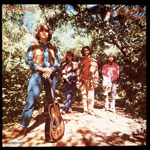
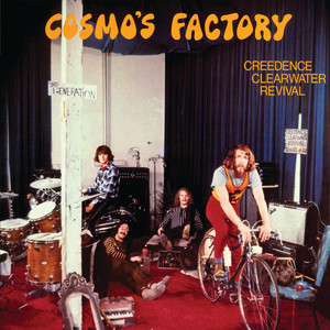
The cover art, design, and photography were designed by Bob Fogerty, brother to John and Tom Fogerty.
Rock critic Ralph Gleason referred to CCR as an excellent example of the "Third Generation of San Francisco bands" so they included a sign saying "3RD GENERATION" on the cover.source - Goldmine magazine
It would have made this excellent cover even better if they had integrated the title physically into the photo.
Still all in all a fabulous album and sleeve.
This was the first of three covers by Don Brautigum, who previously painted Metallica’s iconic Master Of Puppets. “Poltergeist had a very strong visual image to me and I liked the way it looked,” Charlie Benante, the drummer, explained to PureGrainAudio. “I was always into horror, and Among The Living was basically about good and evil. It was just about how much evil there is amongst us.” Charlie Benante. Seizing control of the band’s aesthetic after the widely-ridiculed Fistful Of Metal sleeve, Benante has conceived, overseen and approved every image the band have since stamped their name on, tracing an artistic line from the garish excesses of the 80s, through the moody, minimalist 90s, to the hip superhero likenesses and ‘Pentathrax’ insignia of their post-millennial graphic design. In 2016 Charlie told Artist Direct “That’s one of the reasons I still take the time and effort to make an album cover: I want our audience to get lost in it.” source Loudersound.com
Who is he trying to kid? Don Brautigum has some skills and using the same illustrator for 3 sleeves gives some continuity, but the sleeves are horribly immature.
The iconic logo for the American heavy metal band Anthrax was designed by their former lead guitarist, Dan Spitz. He created the classic text-based graphic for the band in the 1980s. Source logos world.net
Love it or hate it, its spelt correctly and its repetitious use for merch will be the envy of many a worldwide brand.
All of this is great if you like grown men shouting while aimless tuneless noise fills the background.
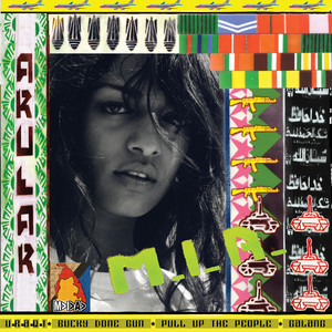
Maya Arulpragasam and Steve Loveridge, having met at St Martins, created the artwork in photoshop with very little understanding of the program, which gives the sleeve its charm.
source Under the covers- Eye on design 2020
I missed this when it came out and both artwork and music are excellent and well paired to each other.
M.I.A seems to have pissed off quite a few people and currently has been sacked from the Kid Cudi tour.
his words ‘I Won’t Have Someone on Tour Making Offensive Remarks’
Am I still allowed to like this album?
The album's sleeve was designed and art directed by Andrea Klein and the photographer was David Michael Kennedy. The chosen photograph was not actually taken in Nebraska; Kennedy had captured it during a road trip through a winter snowstorm in Colorado in December 1975. source Santa Fe New Mexican. source amateur photography
The capitalized red letters offer a bloody imagery to the already dark tone of the album’s artwork and music. Springsteen himself described the album by saying, “It was all just very bloody in its own way.” source various.
Not being a Springsteen fan I was ready to hit the 1* button but having played it through I find myself liking it. How did that happen?